Power Edit is a time-saving feature that allows you to select multiple pages in your store and edit one or more of their attributes all at once. For example, you could change the background color for half of your pages, or you could add a link image to all your new pages.
Page Name |
The name of the page is used to describe the page in the list of pages in your Back Office, and must be unique. You may optionally also display the name at the top of the page. |
Name Toggle |
Check this box if you want the Page Name to be displayed at the top of the page. This box is checked by default. The name will usually appear beside the Page Graphic, if there is one. |
Title |
This field allows you to specify text to be used in the HTML title tag, the contents of which are displayed in the browser window title bar. If this is left blank, most templates will use the Page Name for this field. |
|
Select the graphic, if any, that you want to appear on the top of this page. It will appear above the text and products on the page or down the left side of the page, depending on the page theme or template that you choose. See the Image Tool help for more information on selecting an image. If you want to insert an image anywhere else on the page, use an HTML tag in that field. |
Graphic Toggle |
Check this box if you want to display a page graphic on this page. This box is checked by default. This will not change the Banner Graphic settings, but the selected graphic will not be displayed on the page if you uncheck this box. |
Text 1 |
This is the primary text on the page. It will usually appear beside or below the banner graphic, depending on the page theme or template that you choose. You can enter any combination of text and HTML into this field. This field supports use of the HTML Editor.
|
Text 2 |
This is the secondary text on the page. It will usually appear below the products, depending on the page theme or template that you choose. You can enter any combination of text and HTML into this field. This field supports use of the HTML Editor.
|
Text 3 |
This is a third field for text on the page. It will usually appear just above the page footer, depending on the page theme or template that you choose. You can enter any combination of text and HTML into this field. This field supports use of the HTML Editor.
|
Link Info
If other pages in the site are going to display links to this page, use these fields to configure the content of the link. Note that this determines how links to this page will appear on other pages.
|
Link Name |
Use this field to indicate the name of the page in the link. You may want to make this the same as the Page Name, or you may want to use a different name. For example, the main page (index.html) for your store may have Welcome as the Page Name, but you may want to use Home for the Link Name. You may also leave this field blank and use a graphic instead. If you leave this field blank, and there is no Link Graphic or Link Text, the Page Name will usually be used to create links to the page. |
Link Graphic |
You can optionally include a graphic in your page links, either with or without other link content. For example, you could create an icon or button that indicates the destination of the link, or you can use a generic graphic for all your page links, or you could use a small image to indicate new pages on your site. You should consider keeping link graphics relatively small (less than 50px by 50px) to keep the links from taking over the page. See the Image Tool help for more information on selecting an image. |
Link Text |
You may optionally include additional descriptive text in your link. This text is usually displayed in a smaller font than the Link Name, and may not actually be part of the link, although it will always be beside or below the link.
This field supports use of the HTML Editor.
|
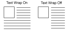
Link Text Wrap |
If this option is set to On (default), and you have both a graphic and text for your page link, the text will wrap around under the image. Otherwise, it will appear to the right of the image in a straight column.
|
Links to Page |
Click on the Select button to bring up a new window that will allow you to select which pages you want links to this page to appear on. The top box lists all the pages that are set to have links to your current page. To remove a page from the list, select it and click on the Delete button. The page name will now appear in the lower box, which is a list of pages that do not have links to the current page. You can select pages from the lower box and click on the Add button to move the pages to the top box. When you are finished making changes, click on OK to save your changes, or Cancel to close the window without saving. |
Layout Info
These options give you control over formatting the products and page links that appear on your page.
|
Page Template |
There are several page themes and templates to choose from to customize your store's look and feel. If you have applied a theme to your store, selecting a different template here may give unexpected results. See the Page Templates documentation for a description of the different page themes and templates. There are also several product templates that you can use to control the way that individual products are displayed. |
Item Alignment |
Choose how you would like products and page links aligned in each column. This setting does not affect the Text1, Text2, and Text3 fields. Remember that you can also apply Product Templates to further customize how each product image lines up with the product name, price, and description. |
Columns |
This setting affects the products and may affect the links, but does not affect the Text1, Text2, and Text3 fields. Laying out your products or links in two or three columns is often a good idea, aesthetically. Depending on how wide the items are, you may even be able to fit more columns, but remember that not everyone can view wide pages without scrolling. It is usually safe to design the page to be viewed at 800x600 resolution. |
Column Borders |
Checking this box will create a border around each product and (depending on the template) link on your page. |
Page Width |
Setting the page width to less than 100% will create margins on the page. If you set the width to 90%, the page will have a 5% margin on each side, and the contents of the page will be displayed in the remaining 90% in the middle. Margins can improve the aesthetic quality and readability of a page. |
Page Header |
Check this box to place your store's page header at the top of this page (or down the left, depending on the page template you choose). You can edit the page header for your store by going to Preferences > Layout Settings in your store's back office. |
Page Footer |
Check this box to place your store's page footer at the bottom of this page. You can edit the page footer for your store by going to Preferences > Layout Settings in your store's back office. |
Text Color |
This is the color that will be used for normal (non-link) text on this page. This color is set when you select a theme, or you can change it using the Color Picker Tool. Page text should usually be a dark color that contrasts with the background color. |
Background Color |
This is the color that will be used in the background of your page. This color is set when you select a theme, or you can change it using the Color Picker Tool. If there is a background image, the image will cover the background color. The background color should usually be a light color that contrasts with the page content. |
Link Color |
This is the color that will be used for unvisited links on your page. This color is set when you select a theme, or you can change it using the Color Picker Tool. It is usually a good idea to make the link color easily distinguishable from the text color. |
Visited Link Color |
This is the color that will be used for links that a visitory has already visited. This color is set when you select a theme, or you can change it using the Color Picker Tool. This color is usually, but not always, different from the link color. |
Active Link Color |
This is the color that will be used for links that are active, meaning a customer has clicked on them. Several templates also use this for the link hover color, meaning the link will change to this color when a customer's cursor is over the link. This color is set when you select a theme, or you can change it using the Color Picker Tool. This color is frequently the same as the visited color. |
|
A background image is an image displayed behind the content of the page (but in front of the background color), and can significantly improve the visual appeal of the page. This image is set when you select a theme, or you can change it using the Image Tool. Most templates will tile the background image, repeating it across and down the page, to cover the entire page. For this reason, it is usually a good idea to use an image specifically designed as a background image. The Elite and Gradient Page Templates are great examples of using a background image to add a distinctive look to the page. |
Advanced Info
The fields in the Advanced Info section help search engines to find your pages, and help customers to find products on your pages.
|
File Name |
This setting is optional. Use this field to give the page a file name that describes the page's contents, such as "wooden_toys.html" or "customer_service.html." Be sure to put a .html or .htm suffix on the end of the file name, or the page will not display correctly. If you do not assign a name to the page, it will have a default file name, such as page1.html or page2.html.
The file name cannot contain spaces or any of the following characters: '?', '+', '=', '&', '@' |
Meta Keywords |
Meta keywords are used by search engines such as Google, Yahoo!, and Lycos to match searches to the information on a page. Enter keywords that search engines should match to find this page. |
Meta Description |
Enter a description that you want search engines to display for this page when a search matches this page. Not all search engines use the Meta description text.
You can also use this field to insert meta tags and other material into the <HEAD> section of the page, such as META fields or JavaScript code. First, type in any text that you want within the <META desciption= > tag and close the tag with ">. Then type in any additional tags or scripts (the field scrolls to hold more lines). Do not put the closing "> at the end of your last tag, as ShopSite will add that automatically. For example, to add a META name tag, you might enter something like this:
your, keywords, go, here"><META name="your meta tag" content="your content |
Product Search Field |
Check this box to include a Product Search box on this page, which allows customers to search for products in your store. |
Index |
Check this box to allow this page to be indexed so that it can be found when customers search for products on your site. This box is checked by default. |
Google Sitemap Settings |
Check the Include in Sitemap box to include this page in your Sitemap. This box is checked by default. You can optionally use the Priority pull-down menu to indicate the importance of this page in your site. |
Page Arrangement Settings
Use the fields in this section to set the order in which products and page links are displayed on this page.
Note: |
Using the Arrange Items feature to sort the products on this page will override any Page Arrangement Settings you make here and set the Order field back to None.
|
|
Order |
Select either ascending (0-9, a-z) or descending (9-0, z-a) sort order for products and page links, or select None to turn off any special sort order. |
Products Sort Field |
Select to sort products on this page by name, SKU, price, or description. |
Pages Sort Field |
Select to sort links to other pages by page name or link name. |
Products On Top |
Check this box to sort all products above links on this page. In most cases, this will not actually affect the appearance of the page. |
Pagination
Pagination makes it easy to break up long pages into multiple, shorter pages. Rather than having to create several identical pages yourself, then decide which products to assign to which page, you can have ShopSite automatically break the page up into several identical pages that are linked together.
|
Number of Products per Generated Page |
Enter the maximum numbers of products that you want ShopSite to display on a page. If you assign more than this number of products to this page, ShopSite will automatically generate additional pages as needed. Each page will have navigation links to let customers move between the pages. (You can set the maximum number of pages generated on the Publish screen.) |
Extra Fields
ShopSite lets you Configure up to 10 extra fields to use with your page. You can use these extra fields in any number of ways. If you are using a custom template to create this page, you can use the Page Fields to include additional information about this page that does not fit in any of the predefined fields. Your custom template must include tags for these fields or the information will not be displayed.
These fields support use of the HTML Editor. |