Default Page Template
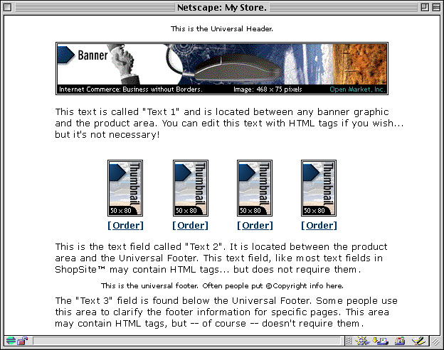
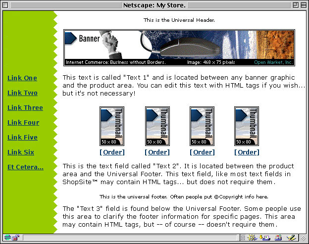
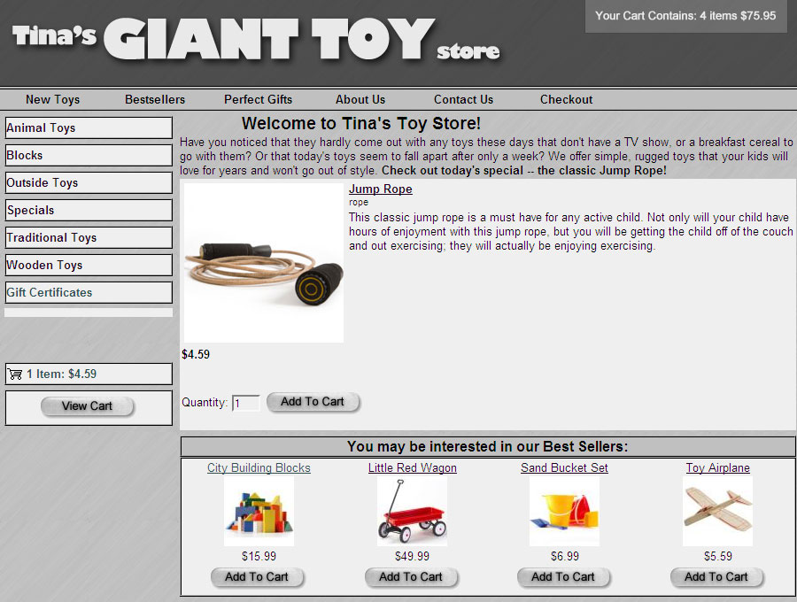
The default template uses a straight-forward "top to bottom" approach. The universal header is placed at the top of the page, followed by the banner graphic and the Text 1 field. Any products and links to other pages appear under the Text 1 field. The Text 2 field is under the links, and the bottom of the page has the universal footer and then the Text 3 field.
Text 3 On Left Side
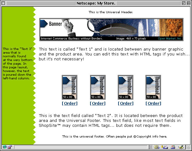
Instead of placing the Text 3 element below the page footer, the Text 3 On Left Side template places it on the left side of the screen. You can include HTML code within the Text 3 field, thereby creating navigation links to other pages in your store, if desired.
Page Graphic Down Left Side
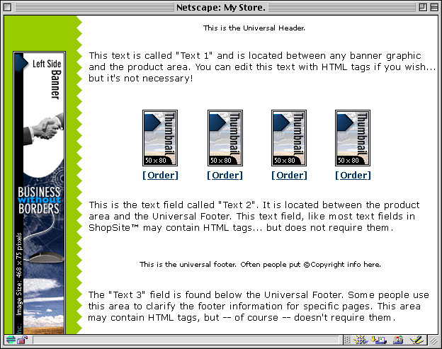
The Page Graphic Down Left Side template is very similar to the default template, except that the banner graphic is displayed at the left side of the page, and all other elements are moved to the right.
Header Down Left Side
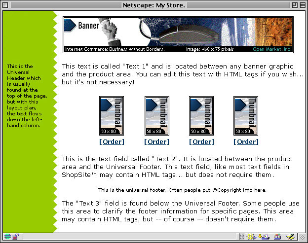
The Header Down Left Side template is similar to the Text 3 Left template, except that the universal header is run down the left side of the page instead of the Text 3 element. Though the difference may seem subtle, this template may be a good choice if you want your banner graphic to be at the top of the page, but don't want to waste the universal header field.
Page Links Down Left Side
The Page Links Down Left Side template places links to other pages to the left of all of the other elements, creating a left-side navigation bar.
Matte Theme
The Matte theme frames all page elements in a two-color border, like the matte on a framed picture.
Mondrian Theme
The Mondrian theme puts a thin border around each page. The page name and banner graphic are put against a colored rectangle just inside the border at the top. All text fields and product information are displayed in a wide column below the page name against a white background. Page links are in a narrow colored column to the right of the product information.
Lefty Theme
A wide vertical stripe of one color runs down the left side of the page in the Lefty theme, containing the page banner graphic and links to other pages in your store, if any. All other page elements are displayed to the right of the stripe.
Topnotch Theme
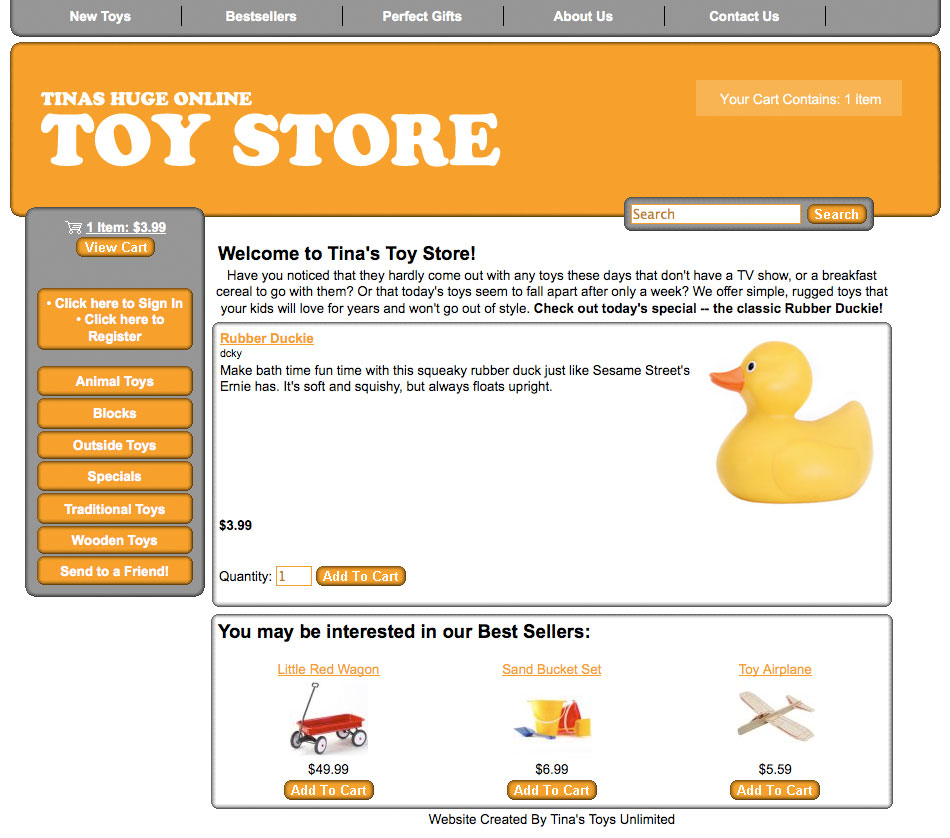
The Topnotch theme puts a horizontal strip of color across the top of pages, with the page banner graphic in the top right corner and the page name to the left of the graphic. Links to other pages are in a narrow column down the left side of the page, and all product information and text fields, including the page header and footer, are in a wide column that fills the rest of the page.
Rounded Theme
The Rounded theme uses complementary or contrasting colors to create a colored top and left side. The corners of the colors are rounded off for a finished look. The page banner graphic is in the top left corner, and page links are in the left column. All text fields and product information fill the remainder of the page.
Stained Glass (sg) Theme
The Stained Glass theme uses several graphic components to create a border around the page. The page has a fixed width, but can be as tall or short as necessary. The page name and buttons for page links also have graphic backgrounds. All text fields and product information is in the main part of the page.
Sidebar Theme
The Sidebar theme is similar to the Lefty theme, but with a little more finesse. The page graphic and navigation links are in the left column, and text fields and product information are in the main column.
Tab Theme
The Tab theme puts the page header and graphic at the top of the page, and then puts all the page links in horizontal rows of tabs below that. The page name and all product information are below the tabs. The Tab theme supports all the features in the current version of ShopSite.
Elite Page Template
The Elite page template uses the Universal Header as the page banner, and places page links vertically down the left-hand side of the page. The Page Name and graphic, along with the product information, is located to the right of the links. The Elite page template incorporates all the latest ShopSite features, but may take a bit of effort to get looking exactly the way you want. The Elite theme supports all the features in the current version of ShopSite.
Awesome Orange Page Template
The Awesome Orange Page template is used by the Awesome theme. It is intended to provide merchants with an easy way to get a good-looking store. The Awesome Orange Page template is designed to be used as a part of the Awesome theme, and may not work properly if used with other templates. The colors used on pages are determined by the theme, and changing page colors will have no affect when using this template. The Awesome theme supports all the features in the current version of ShopSite.
Classy Page Template
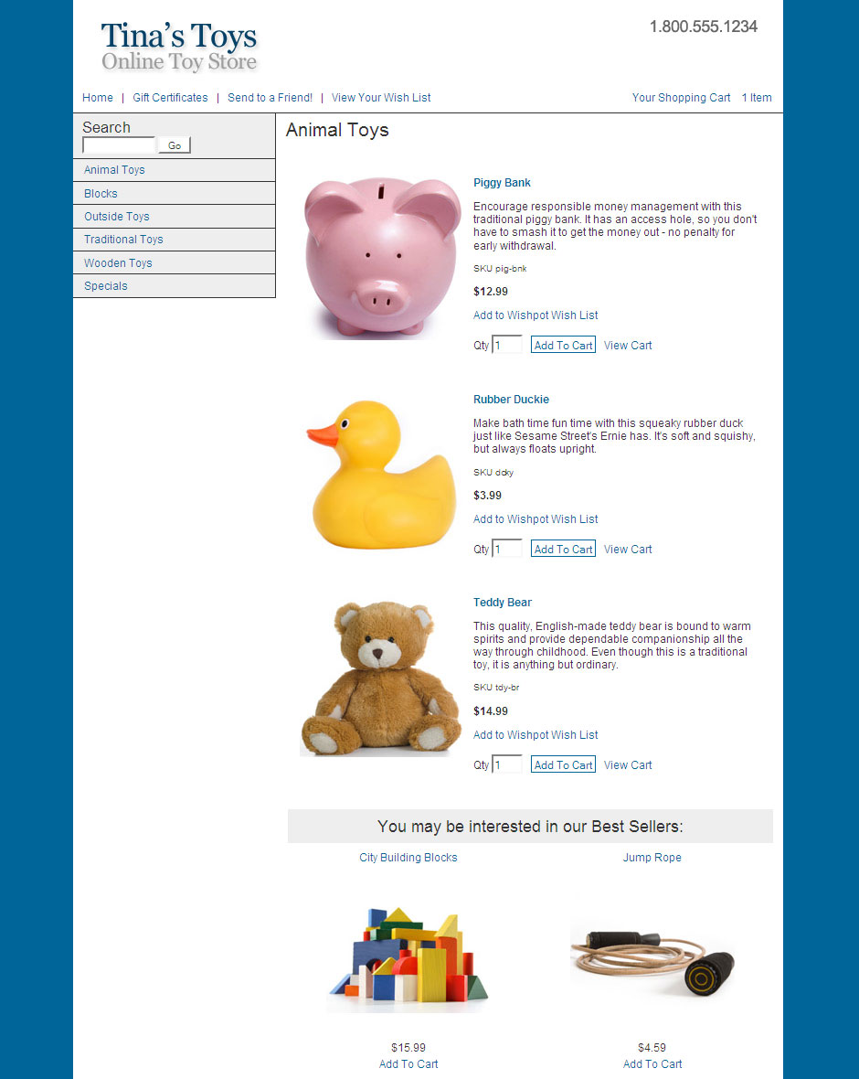
The Classy Page template displays the universal page header in a colored banner at the top. Page links and the search field (if available) will appear in the left-hand column. The center column displays the product list. A third column contains customer registration, minicart, gift certificate, and Tell A Friend information if they are on. The color used for the banner and the left-hand and right-hand columns is the Shopping Cart Shade Color. The Classy Theme supports all the features in the current version of ShopSite.
Cross Sell-Sky
The Cross Sell template puts the universal header at the top of the page, with a row of links across the page below it. These links can include customer registration, Tell A Friend, minicart, and Gift Certificates, if they are enabled. There is a block on the left-hand side of the page that contains the search feature (if enabled) and page links. Products are displayed to the right of the page links. The Cross Sell theme supports all the features in the current version of ShopSite.
Gradient
The Gradient theme frames the page with a gradient background. The universal header is across the top, with a bar below it containing the search, customer registration, gift certificate, and send to friend links, if they are enabled. Page links are down the left side, with the products featured in the center. The minicart, if enabled, is on the right-hand side. The Gradient theme was introduced in ShopSite version 8.2, and supports all the features in the current version of ShopSite.
Modern
The Modern theme displays the universal header at the top, with a navigation bar down the left side, and a merchandising bar down the right side of the page. The products are displayed in the center of the page. The Modern theme does not support the MiniCart. The Modern theme was introduced in ShopSite version 9.0 and supports most of the features in the current version of ShopSite.
Clean
The Clean theme displays the universal header at the top left of the page, with search and tell-a-friend to the right. The page and merchandising links are in a bar down the left, with the products to their right. The Clean theme does not include Customer Registration links or the MiniCart on the page. The Clean theme was introduced in ShopSite version 9.0 and supports most of the features in the current version of ShopSite.
