Name Toggle
Check this box if you want the Page Name to be displayed at the top of the page. This box is checked by default. The name will usually appear beside the Page Graphic, if there is one.
Graphic Toggle
Check this box if you want to display a page graphic on this page. This box is checked by default. This will not change the Banner Graphic settings, but the selected graphic will not be displayed on the page if you uncheck this box.
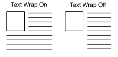
Link Text Wrap
If this option is set to On (default), and you have both a graphic and text for your page link, the text will wrap around under the image. Otherwise, it will appear to the right of the image in a straight column.
Layout Info
These options give you control over formatting the products and page links that appear on your page.
Page Template
There are several page themes and templates to choose from to customize your store's look and feel. If you have applied a theme to your store, selecting a different template here may give unexpected results. See the Page Templates documentation for a description of the different page themes and templates. There are also several product templates that you can use to control the way that individual products are displayed.
Item Alignment
Choose how you would like products and page links aligned in each column. This setting does not affect the Text1, Text2, and Text3 fields. Remember that you can also apply Product Templates to further customize how each product image lines up with the product name, price, and description.
Columns
This setting affects the products and may affect the links, but does not affect the Text1, Text2, and Text3 fields. Laying out your products or links in two or three columns is often a good idea, aesthetically. Depending on how wide the items are, you may even be able to fit more columns, but remember that not everyone can view wide pages without scrolling. It is usually safe to design the page to be viewed at 800x600 resolution.
Page Link Columns
This setting determines the number of columns that will be used for links on the page. Laying out your links in two or three columns is often a good idea, aesthetically. Depending on how wide the items are, you may even be able to fit more columns, but remember that not everyone can view wide pages without scrolling. It is usually safe to design the page to be viewed at 800x600 resolution.
Column Borders
Checking this box will create a border around each product and (depending on the template) link on your page.
Page Width
The page width can be measured in either pixels or as a percentage of the screen size. The pixel method is the preferred method, as the pixel values are absolute. If this field is set to 750 pixels, it will always appear as 750 pixels. When using a percentage, the width of the page will vary based on screen resolution, size of the browser window viewing the page, and the percentage chosen. Setting the page width to less than 100% will create margins on the page. For example, if you set the width to 90%, the page will have a 5% margin on each side, and the contents of the page will be displayed in the remaining 90% in the middle. Margins can be useful by improving the aesthetic quality and readability of a page.
Page Header
Check this box to place your store's page header at the top of this page (or down the left, depending on the page template you choose). You can edit the page header for your store by going to Preferences > Layout Settings in your store's back office.
Page Footer
Check this box to place your store's page footer at the bottom of this page. You can edit the page footer for your store by going to Preferences > Layout Settings in your store's back office.
Text Color
This is the color that will be used for normal (non-link) text on this page. This color is set when you select a theme, or you can change it using the Color Picker Tool. Page text should usually be a dark color that contrasts with the background color.
Background Color
This is the color that will be used in the background of your page. This color is set when you select a theme, or you can change it using the Color Picker Tool. If there is a background image, the image will cover the background color. The background color should usually be a light color that contrasts with the page content.
Link Color
This is the color that will be used for unvisited links on your page. This color is set when you select a theme, or you can change it using the Color Picker Tool. It is usually a good idea to make the link color easily distinguishable from the text color.
Visited Link Color
This is the color that will be used for links that a visitor has already visited. This color is set when you select a theme, or you can change it using the Color Picker Tool. This color is usually, but not always, different from the link color.
Active Link Color
This is the color that will be used for links that are active, meaning a customer has clicked on them. Several templates also use this for the link hover color, meaning the link will change to this color when a customer's cursor is over the link. This color is set when you select a theme, or you can change it using the Color Picker Tool. This color is frequently the same as the visited color.
A background image is an image displayed behind the content of the page (but in front of the background color), and can significantly improve the visual appeal of the page. This image is set when you select a theme, or you can change it using the Image Tool. Most templates will tile the background image, repeating it across and down the page, to cover the entire page. For this reason, it is usually a good idea to use an image specifically designed as a background image. The Elite and Gradient Page Templates are great examples of using a background image to add a distinctive look to the page.
Page Arrangement Settings
Use the fields in this section to set the order in which products and page links are displayed on this page.
Note: |
Using the Arrange Items feature to sort the products on this page will override any Page Arrangement Settings you make here and set the Order field back to None.
|
Order
Select either ascending (0-9, a-z) or descending (9-0, z-a) sort order for products and page links, or select None to turn off any special sort order.
Product Sort Field
Select to sort products on this page by name, SKU, price, or description.
Page Sort Field
Select to sort links to other pages by page name or link name.
Products On Top
Check this box to sort all products above links on this page. In most cases, this will not actually affect the appearance of the page.
Pagination
Pagination makes it easy to break up long pages into multiple, shorter pages. Rather than having to create several identical pages yourself, then decide which products to assign to which page, you can have ShopSite automatically break the page up into several identical pages that are linked together.
Number of Products per Generated Page
Enter the maximum numbers of products that you want ShopSite to display on a page. If you assign more than this number of products to this page, ShopSite will automatically generate additional pages as needed. Each page will have navigation links to let customers move between the pages. (You can set the maximum number of pages generated on the Publish screen.)
