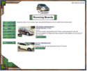
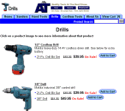
ShopSite provides several different page templates that you can choose from to customize the look of your store. You can select the same page template for each page in your store, or you can use different templates for different pages. However, using the same template on each page provides a consistent look and makes it easier for your customers to navigate your store.
All of the page templates include the same elements, such as space for headers and footers, graphic images, product information, and the Text 1, Text 2, and Text 3 fields. Each page template arranges the elements differently, though.
Click on the name or thumbnail image of a template to see a sample page using that template.
|
 |
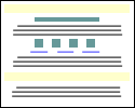
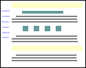
The default template uses a straight-forward "top to bottom" approach. The universal header is placed at the top of the page, followed by the banner graphic and the Text 1 field. Any products and links to other pages appear under the Text 1 field. The Text 2 field is under the links, and the bottom of the page has the universal footer and then the Text 3 field. |
|
 |
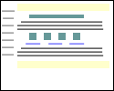
Instead of placing the Text 3 element below the page footer, the Text 3 On Left Side template places it on the left side of the screen. You can include HTML code within the Text 3 field, thereby creating navigation links to other pages in your store, if desired. |
|
 |
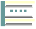
The Page Graphic Down Left Side template is very similar to the default template, except that the banner graphic is displayed at the left side of the page, and all other elements are moved to the right. |
|
 |
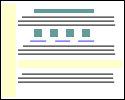
The Header Down Left Side template is similar to the Text 3 Left template, except that the universal header is run down the left side of the page instead of the Text 3 element. Though the difference may seem subtle, this template may be a good choice if you want your banner graphic to be at the top of the page, but don't want to waste the universal header field. |
|
 |
The Page Links Down Left Side template places links to other pages to the left of all of the other elements, creating a left-side navigation bar. |
|
 |
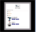
The Matte theme frames all page elements in a two-color border, like the matte on a framed picture. |
|
 |
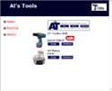
The Mondrian theme puts a thin border around each page. The page name and banner graphic are put against a colored rectangle just inside the border at the top. All text fields and product information are displayed in a wide column below the page name against a white background. Page links are in a narrow colored column to the right of the product information. |
|
 |
A wide vertical stripe of one color runs down the left side of the page in the Lefty theme, containing the page banner graphic and links to other pages in your store, if any. All other page elements are displayed to the right of the stripe. |
|
 |
The Topnotch theme puts a horizontal strip of color across the top of pages, with the page banner graphic in the top right corner and the page name to the left of the graphic. Links to other pages are in a narrow column down the left side of the page, and all product information and text fields, including the page header and footer, are in a wide column that fills the rest of the page. |
|
 |
The Rounded theme uses complementary or contrasting colors to create a colored top and left side. The corners of the colors are rounded off for a finished look. The page banner graphic is in the top left corner, and page links are in the left column. All text fields and product information fill the remainder of the page.
|
|
 |
The Stained Glass theme uses several graphic components to create a border around the page. The page has a fixed width, but can be as tall or short as necessary. The page name and buttons for page links also have graphic backgrounds. All text fields and product information is in the main part of the page.
|
|
 |
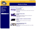
The Sidebar theme is similar to the Lefty theme, but with a little more finesse. The page graphic and navigation links are in the left column, and text fields and product information are in the main column.
|
|
 |
The Tab theme puts the page header and graphic at the top of the page, and then puts all the page links in horizontal rows of tabs below that. The page name and all product information are below the tabs.
|
