Power Edit
Power Edit is a time saving feature that allows you to select multiple pages in your store and edit one or more of their attributes all at once. For example, if you would like to change the background color for half of your pages, select those pages, from the list, hit the "power edit" button, and then select background color from the list of fields. A window containing the name of each page selected and a background color menu will be generated, allowing you to make the change easily.
Control click to select the item or items that you would like to edit, then hit the "power edit" button. You will see a list of all the fields you can edit for the product or page. Control click to select the fields you need to edit and hit "ok". A page will be generated with the requested fields for each product you selected. Another example: if you would like to change price and description for several products to be put on special, select those products, hit "power edit," select "price" and "product description" from the list of fields, and hit "ok." Then make the required changes on the page that comes up. For a detailed description of the fields you have to choose from, see below.
A new feature for ShopSite Pro stores is the choice to power edit items universally or individually. When you select the pages you wish to edit and a list of fields is given, there will be two radio buttons below the list saying, "Edit the fields of selected pages individually" and "Edit the fields of selected pages universally." By default the individual option is selected which means a separate set of fields is given to you to edit for each page. Selecting the universal option one single set of fields is presented for editing (with the values taken from the first page you selected to edit.) The changes you make to these fields will be applied to all the pages you originally selected to edit.
Page Name - This is the name of the page that will appear at the top of the page and at the top of the browser window when viewed on-line. This is also the name of the record in the database (the list of pages), so even if you have four pages of T-shirts, you may want to name the pages "T-shirts Page One" and "T-shirts Page Two" so you can differentiate.
Display name on page - If you have a banner graphic for the page that contains the page's name, you will probably want to uncheck the "display name" box. You will still need to give the page a name, so it appears in the database, but the name will not appear on the page under your banner graphic.
Banner Graphic - Select the graphic that you want to appear on the top of this page. It will appear above all the text on the page. If you want to insert an image anywhere else on the page, you can use an HTML tag. Use the radio button to select the method for finding your image.
Display banner graphic on page - This feature is useful if you would like to temporarily remove the banner graphic from the page, but not have to find it in the list when you want to put it back.
Text1 - Text entered here will appear immediately below the graphic and page name, but above any products or page links. You can enter any combination of text and HTML into this field.
Text2 - Text entered here will appear immediately below the products and page links, but above universal page footer (if there is one). You can enter any combination of text and HTML into this field.
Text3 - With the default template, text entered here will appear immediately below the universal page footer (if there is one). You can enter any combination of text and HTML into this field. Note: Some page templates, if selected, will display Text3 text in other places.
Link Info - If other pages in the site are going to display links to this page (the one you're editing now), then you need to provide link information. The only page that might be left without link information is the Main Page, but you may want to consider linking every page back to the main page too. Remember that you are also free to use custom HTML to make links to your pages, if you do not like the way that they are displayed by default.
Link Name - This will usually be the same as the Page Name you entered above. This is the text that will appear on the referring page. It will appear "hot", that is, clicking on the text will take the browser to the new page. You may decide to display either a text link, a graphic link, or both.
Link Graphic - This is a clickable graphic that appears on the referring page, clicking on this graphic brings up this page, the same as the product name. You may decide to display either a text link, a graphic link, or both. Use the radio button to select the method for finding your image.
Link Text - This is text that accompanies the link name and/or graphic on the referring page. It is optional.
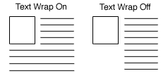
Link Text Wrap - If this menu is set to "on", then if you have both a graphic and text for you page link, the text will wrap around under the image, otherwise, it will continue in a straight column You will only need to set this menu if your link contains a lot of text.
Link Location - Every page you have created will appear in this section with a check box next to it. Every page checked will display a link to this page. Example, if the page you are editing now is "silverware", if you check none of these boxes, no links to the silverware page will appear in the site. If you check all the boxes, it will appear on all the pages.
Page Template - There are several page templates to choose from so you can customize your site's look and feel. There are also several product templates. See the page templates documentation for a description of the different page templates.
Lay Out Items On Page - These options give you control over formatting the items (products and links to other pages) that appear on your page. Remember that the text you entered in the fields above will not be subject to this formatting. If you select two columns, your products will appear in two columns, but your text will appear in one. You can use HTML to format your text if you desire.
Item Alignment - Left aligned text appears normal, with the text flush to the left side of the page. Right aligned will make the items flush right. It usually does not look good with text, but if the items are graphics only (links to other pages, all the same width, for example) it looks good. Centered alignment will center the items within the column, and staggered will alternate between left and right aligned.
Columns - Laying out your products or links in two or three columns can be very attractive. Depending on how wide the items are, you can even do more, but remember that not everyone can view the page as wide as you can. Try to assume that people will be viewing the site on a 14" monitor.
Display Column Borders - Checking this box will create a border around each product and link on your page.
Display Universal Header - This will place your store's universal header at the top of this page (or down the left, depending on the page template you choose.
Display Universal Footer - This will place your store's universal footer at the bottom this page.
Page Width - Setting the page width to less than 100% will create margins on the page. If it set to 90%, then it will be laid out 5% on one edge, 90% in the middle, and 5% on the other edge. Placing margins on the page can drastically improve its aesthetic quality.
Text Color - This sets the default display of non-link text on a particular page to the color you choose. Be sure to choose a dark color (black is usually best) unless your background is dark, because you want to make sure your site is easy to read. A sample of each color choice can be found here.
Background Color - The entire background of your page will be displayed in the color you choose here, unless you select a background pattern (see below), in which case the pattern will appear instead of the color. Be sure to choose a light color for the background unless you have selected a very light color for your text. A sample of each color choice can be found here.
Link Color - Unvisited links to other sites will appear in the color you select here. A sample of each color choice can be found here.
Visited Link Color - After the link has been clicked on, and the page has been visited, the color of the link will change to the color you select here, to let people keep track of where they've been. A sample of each color choice can be found here.
Active Link Color - The color selected here will only be visible at the exact moment they are clicking on the link. It's fun to use a bright color here. It adds pizzazz. A sample of each color choice can be found here.
Background Image - If you have uploaded an image of a textured background to your media directory, you can use that image as a background for your site. Be careful, the image will tile, meaning that it will appear repeating over and over like tiles, so if you use an image that is not a consistent pattern, it will be very ugly. You should only use images that were designed specifically for backgrounds. Use the radio button to select the method for finding your image.
File Name - This setting is optional. Rather than let the system give you the default page file names (page1.html, page2.html, etc.), you can give the page a file name that describes the page's contents. Be sure to put a .html or .htm suffix on the end of the filename, or the page will not display correctly.
Meta Tags - New in version 3.2 is the ability to tell Search engines such as Yahoo! and Excite what the keywords are that they should match to find this page. The Description field is used by many engines as what should be displayed when a search matches this page.
Product Search - New in ShopSite Pro is a product search engine for your site. By checking the Product Search box a field for inputting words to search on will be added to the page. All your products and their descriptions will become searchable by shoppers.
Note: The following options are only available if you are using ShopSite SC Pro.
Order Button - Use this field to customize the order button for an individual product. For example, you can replace the text with an "Order now at Reduced Price" image. You can also change the button text or remove the order button for this product entirely. To remove the button, simply make this field empty.
Checkout Button - Use this field to customize the checkout button for an individual product. For example, you can replace the text with an image of a cash register. You can also change the button text or remove the checkout button for this product entirely. To remove the button, simply make this field empty.
If you are not finding the help you need, please give detailed feedback.